Established in 1984, Shoes For Crews (SFC) created the “slip-resistant” category of work shoes. In 2017, an updated logo was sought in order to position SFC as the parent company to newly-acquired sub-brands.
Design inspiration

The new logo features design elements which stay true to the company’s heritage. The grid pattern is part of the patented technology which makes the product such a success. Combined with a heel shape, the icon becomes a beacon which can be used alone as a “shield” or as a lockup with the Shoes For Crews name.
Alternate versions
![]()
Various logo versions/orientations were created to allow flexibility in the marketing media and channels. Such as web, mobile and trade shows.
Identity evolution and transition
![]()
Starting with the 2016 logo, a blue logo version was created in order to transition to the new (2017) logo without alienating longtime clients. The beacon on the right is currently used on the footwear and will eventually be able to stand on its own, similar to the Nike swoosh or Adidas stripes.
Logo lockups across the brands
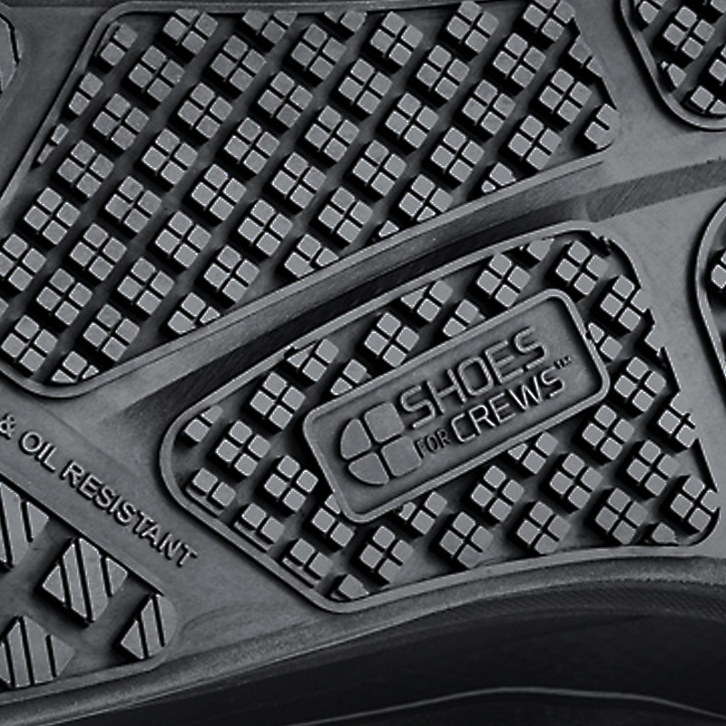
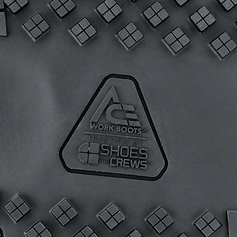
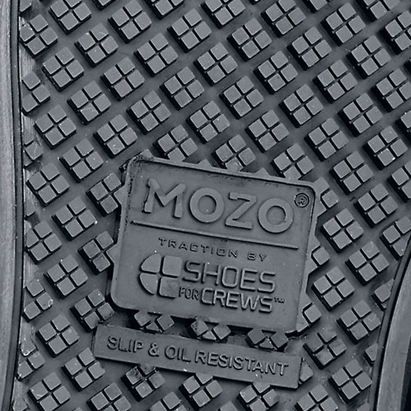
The various sub-brands all incorporate the patented SFC outsole technology. Unique logo lockups were created for each brand for use on the outsole itself.
Identity guidelines

Once the SFC identity was established, a brand guide was created for the internal teams and for the many agency partners.